Futurium Berlin
RICHTER MUSIKOWSKI

Products
The FSB 1045 is based on the FSB 1015 model, which was conceived in the 1930s by a company called Wehag. Given the unceasing use of the FSB 1015 model in commercial buildings, we have supple mented it with a variant featuring a return-to-door that conforms to EN 179.

Futuristic receptacle
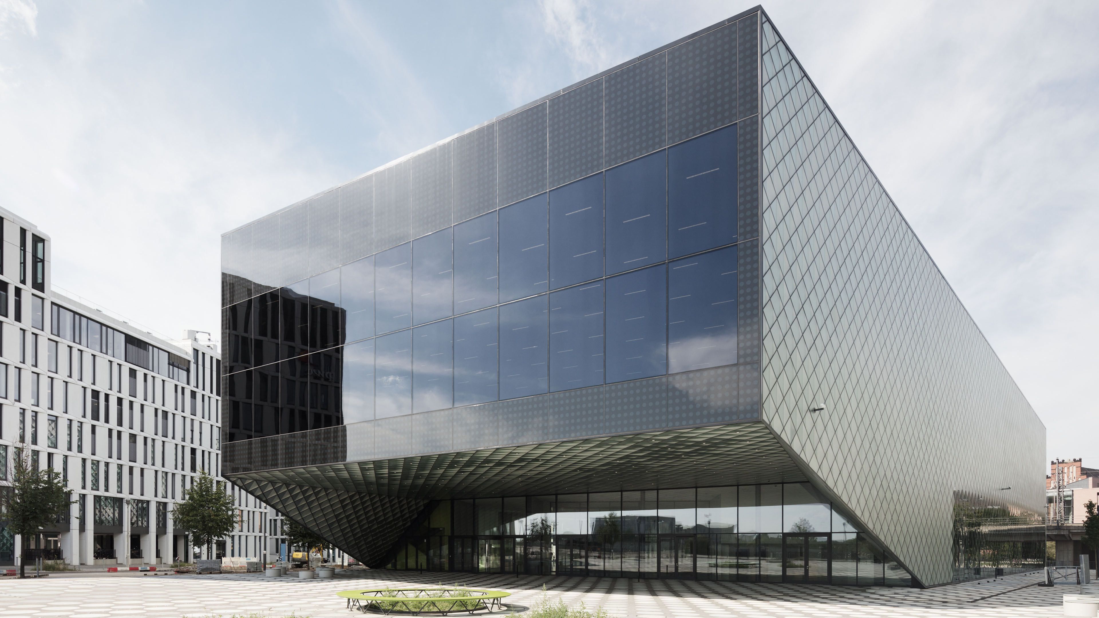
Amongst its surroundings in the Government District, the Futurium building provides refreshing variety with its interesting cube-like structure jutting out to the north and the south, expansive projecting roofs and an envelope that is partly reflective, partly transparent. Designed by architectural firm RICHTER MUSIKOWSKI, the building has been complete for two years now, but it only officially opened on 5 September 2019 – sometimes the future is a long time coming. Within a month the successful landmark had already racked up 100,000 visitors. The three-part exhibition explores the future relationship of people with technology, nature and themselves. But this building is not meant to be a traditional museum at all, and the exhibitions are only part of its offering. It was designed much more as a laboratory, where people can try out futuristic things, and also as a place of dialogue, where interdisciplinary debates and discussions on burning topics of our future can be held.
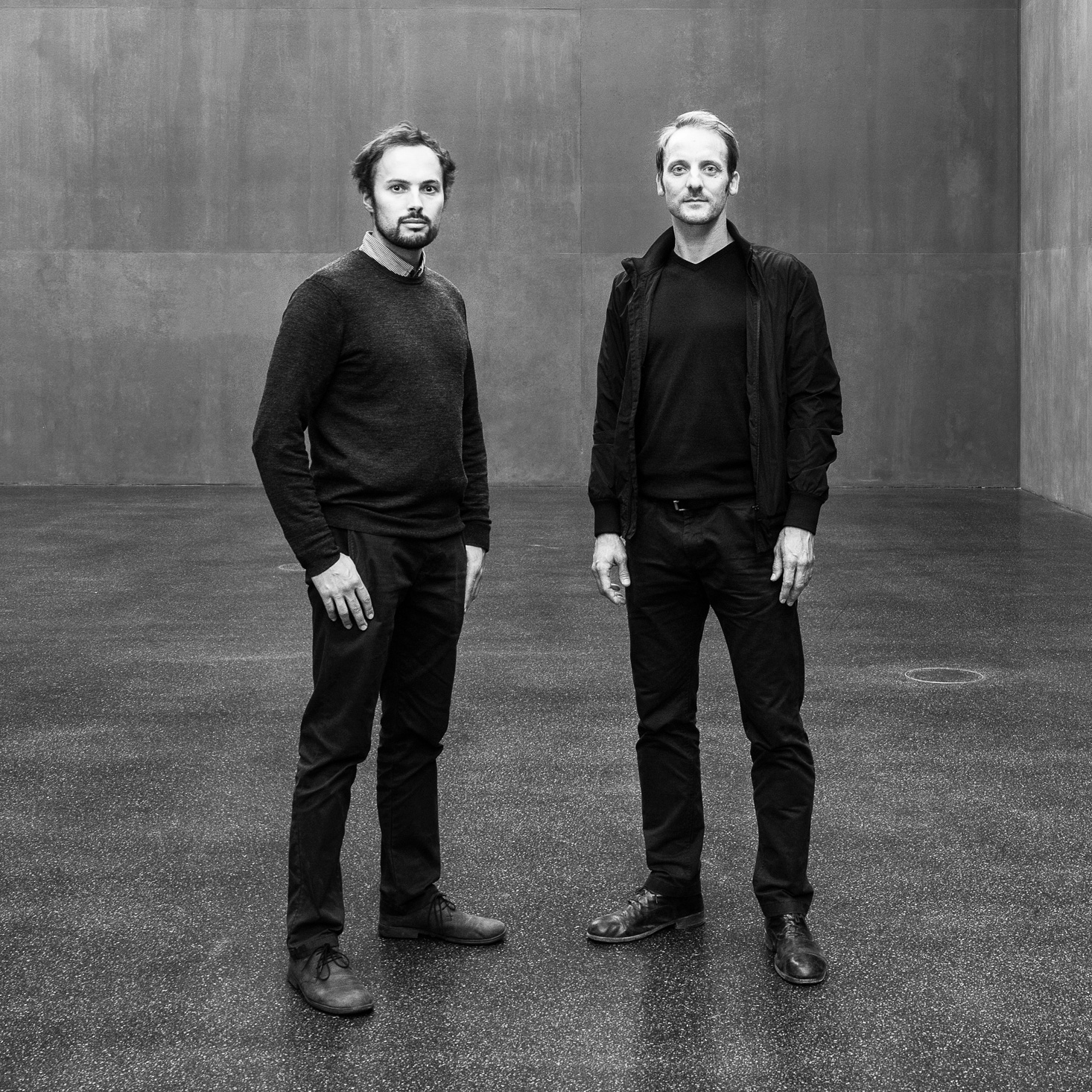
The open competition for the Futurium was the first joint bid for the two architects Christoph Richter and Jan Musikowski, who first met at the Faculty of Residential Buildings and Design at TU Dresden. They founded their firm after having already won the contract and been commissioned with the building project. Such a young firm is probably exactly the right partner for a building that deals with the future – things that do not yet exist. But the criteria specified in the call for tenders ruled out true experiments from the outset.
What does future-oriented architecture look like today? In view of rapid climate change, even the latest ecological technologies are inadequate and will need to be overhauled again in the near future. It goes without saying, of course, that the Futurium is a nearly zero-energy building, that there is an array of solar panels installed on the roof and that the angled roof collects rainwater for reuse.
Above all, however, it is a structure serving as an architectural framework, a potential home for narratives of a future with which no one is yet familiar. ‘Architecture needs to be able say as much as a picture to those who behold it,’ the young architects argue. They aspire to create architectural experiences that move people and trigger images in their minds.
Architects and building
Photo: © Klemens Renner
‘The vessel is here, and it unfolds a narrative framework. And, ideally, the exhibition will take the story further,’ the architects explain.
Darkness and Light
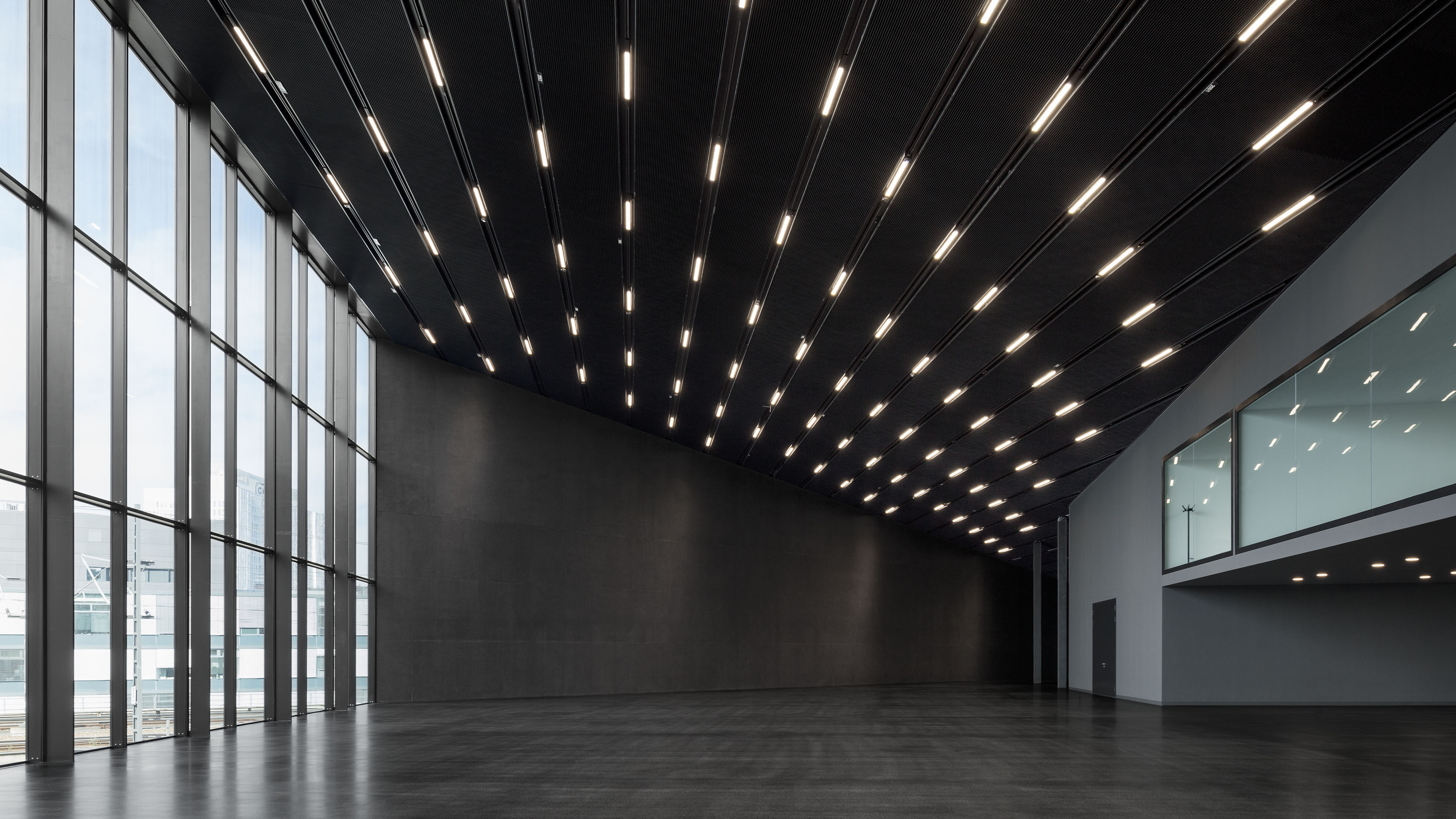
Patterns play a leading role in this architecture. The facade is made up of over 8,000 waffle units that give the structure a visually variable, transparent visage by means of folded metal reflectors and ceramic imprinted glass. A square covered in dots leads visitors to the main entrances. Dotted steps take them from the welcoming foyer to the upper floor. The ceiling of the dark exhibition space inside features a pattern of rows of strip lights.
The ‘Futurium Lab’ located on the lower floor likewise exudes darkness from the painted black exposed concrete and the black mastic asphalt floor, and is also graced by a ceiling patterned by a grid of light shades.
The foyer and central point of congregation on the ground floor, by contrast, has an airy, open feel about it. Bright surfaces define the space’s atmosphere. The ceiling has been executed as a white, backlit metal grille, the walls have been painted white, and there is bright terrazzo flooring. Day¬light courses through the almost 20-foot-high space. A clear sense of con¬trast is provided by black doors leading in and out and linking the foyer with the adjoining spaces. That they are dark and hence suitably conspicuous is a vital asset in any public building and makes getting around easier for visitors. This purpose is also served by room-high doorway assemblies comprising the actual doors plus the fanlights above, both just under ten feet high.
With this kind of scale involved, it wouldn’t have done, the architects felt, to fit handles that came across as being too “small-minded and appended”. They accordingly opted for fittings with a clear visual identity. The stainless-steel handles stand out well against the blackness of the doors. Handles are one of the few items in publicly used buildings that are actually touched, RICHTER MUSIKOWSKI reasoned, and, as a result, great attention also needs to be paid to their aesthetic and haptic properties when deciding which to fit. They selected the FSB 1045 models on the grounds that they “are nicely shaped, rugged and durable, and a pleasure to take hold of.”
Building details
Photos: © Schnepp Renou


