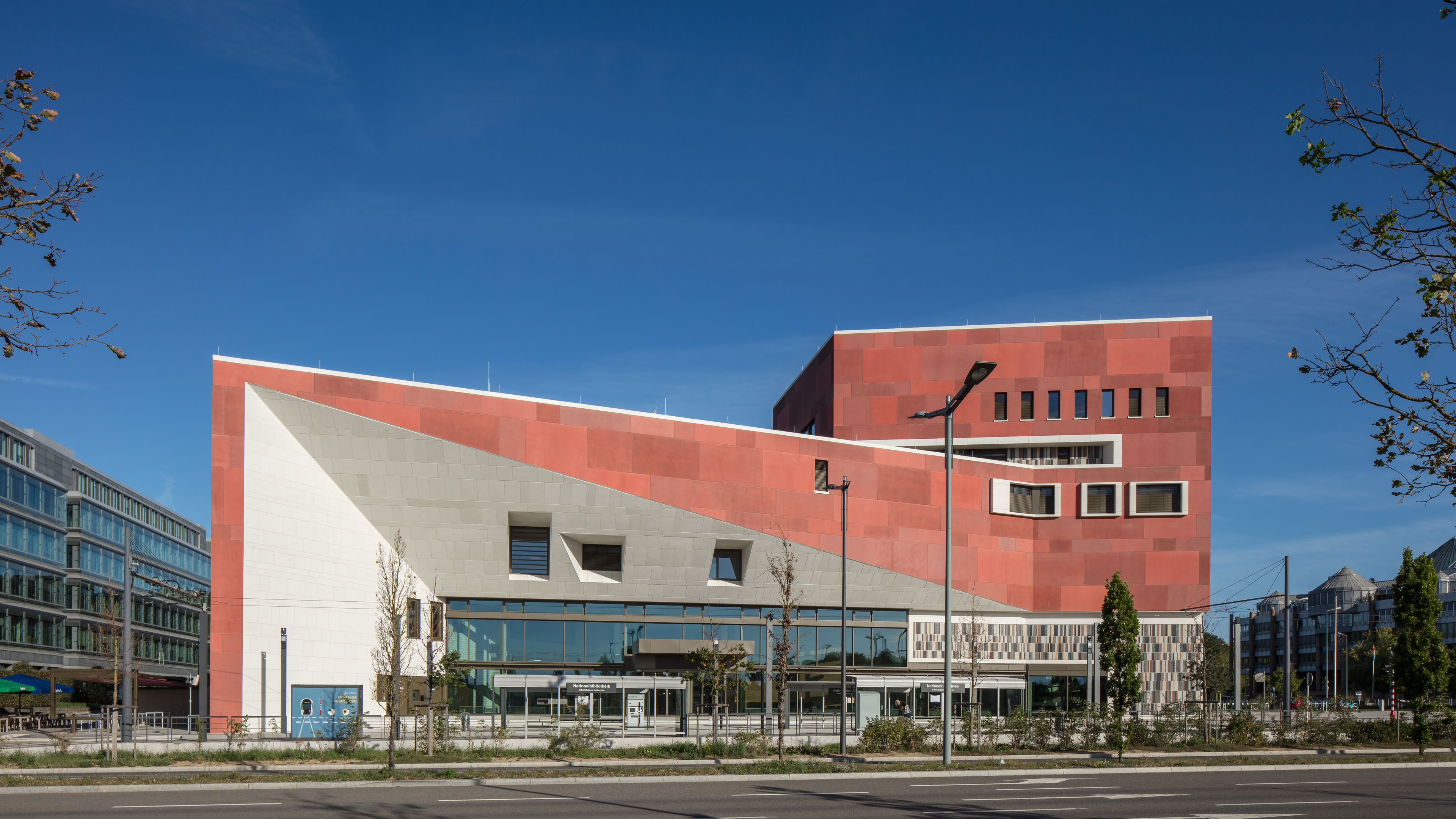
Bibliothéque nationale du Luxembourg, Luxembourg
BOLLES+WILSON with WW+

Products
The FSB 1144 door handle is just as pleasing to the eye as it is to the hand. Jasper Morrison designed this door handle to be instantly recognisable as a tool meant for the hand. Your eyes relax and your hand takes over. Your thumb falls into place, your forefinger finds its hollow and your hand finds something substantial to grasp. This is precisely what the ‘Four-Point Guide to Good Grip’ drawn up by FSB and Otl Aicher calls for.

Culture revitalises the Kirchberg plateau
Recently opened, the new National Library of Luxembourg already graces a special stamp produced by the Luxembourg Post Office. It’s no wonder, because not only is it the archive of the entire history of the small country, but also an impressive building. The Biblioth?que nationale was designed by Münster-based architectural firm BOLLES+WILSON, which was awarded the contract in 2003 following a successful international bid. The building officially opened on 1 October 2019. The library was originally planned for the other end of the long Avenue John F. Kennedy, in a restored old building with a direct view of the historic old town. But plans changed and the architects were commissioned to design a completely new library building for a new location. The library is now situated further down the avenue to the north-east, outside of the old historic centre. It has become part of the extensive urban and cultural development of the district.
Once farmland, the Kirchberg plateau became the birthplace of the European idea, in a manner of speaking, after the Second World War. The district is shaped by European institutions like the European Court of Justice or the Council of the European Union. For several years, however, it has further developed into a vibrant mixed-use quarter. The architects had to come up with a completely new vision for this new location.
‘A cultural building has to conquer this place. It shouldn't stick out like a sore thumb, but it should make a skilful, intentional and sculptural statement,’ Julia Bolles-Wilson says of the urban development challenge. City libraries are changing their role in society in view of the digital transformation. The internet is now the best depository of information. But you can’t retreat comfortably online or meet someone for a coffee to discuss literature.
The Biblioth?que nationale du Luxembourg makes social life the focus and offers a foyer, café and a conference and seminar centre in addition to two and a half million books and media. As an archive, it is also responsible for preserving and sharing Luxembourg’s cultural heritage.
Working together as a consortium:
BOLLES+WILSON (concept, design and detailed planning)
WW+ architektur + management s?rl (tendering and construction management)
Architect and object
Photo: Thomas Rabsch
‘This library guards the complete history of Luxembourg, in the form of 2.5 million media. The placement of the archive was the main factor that determined how the building was organised. It lies at the heart of the building, under the rising reading landscape, encapsulated in fortress-like gabions,’ the architects say of their design.
The library as a landscape
The red for which the architects are famous characterises the building right from the outside and is a recurring theme inside as well. The red-toned concrete slabs have different finishes, creating a lively facade. The sharp-edged tower at the corner gives the library a remarkable presence. Cut out of the building at an angle and clad in white with a tall glass front, the entrance to the building makes its presence known. ‘The entrance, with its dramatic mass of concrete, works like a funnel, drawing visitors into the building,’ architect Peter Wilson elaborates. The grand reading hall features terraced levels, nooks for retreat, larger and smaller spaces, extending the public city to the inside of the building. The red for which the architects are famous characterises the building right from the outside and is a recurring theme inside as well. The red-toned concrete slabs have different finishes, creating a lively facade.
The sharp-edged tower at the corner gives the library a remarkable presence. Cut out of the building at an angle and clad in white with a tall glass front, the entrance to the building makes its presence known. ‘The entrance, with its dramatic mass of concrete, works like a funnel, drawing visitors into the building,’ architect Peter Wilson elaborates. The grand reading hall features terraced levels, nooks for retreat, larger and smaller spaces, extending the public city to the inside of the building.
Natural daylight floods into the reading hall. It comes through from the striking north-facing skylights, which allow lots of light in for reading, but no solar energy, which could damage the sensitive inventory of books. The reinforced concrete structure of the building remains exposed in some areas, like the office rooms, workshops and corridors.
In other rooms, white walls and wooden windows and doors contrast with bold colours, like the blue floor of the reading hall or green seats. A highlight is the special reading room, which is completely in red, where rare artefacts can be explored under supervision. Peter Wilson especially appreciates the smooth shape of the FSB 1144 handle used, which he called a ‘touch vector’. ‘The 1144, designed by Jasper Morrison, is a classic that does not lose its value over time. Its pleasing shape sits nicely in the hand and has a calming effect on both the eye and the spirit,’ Wilson says. Unusually but effectively, the architects combine an aluminium finish with black round roses. This combination, which BOLLES+WILSON used in their design of the Münster City Library over 25 years ago already, has become part of their signature. The contrast sets the handle design apart from the rose in a distinct aesthetic. Object details
Building details
Photos: © Christian Richters


