Museum M9, Mestre
Sauerbruch Hutton
Produkte
Urban renewal in the gateway to Venice
Mestre has been part of the municipality of Venice since 1929. Around four-fifths of the 270,000 Venetians live here on the mainland, and most of them go to work in Venice proper, where tourism continues to rise at extraordinary rates. Mestre has long led a shadowy existence, compared to its wealthier counterpart Venice. Those who cannot (or can no longer) afford to live in Venice come to Mestre, as availability of apartments across the lagoon continues to dwindle. While Mestre has financially benefited over the years from the increasing number of hotels it offers for the 30 million tourists who come to visit Venice every year, for some time it has sought to explore opportunities for cultural development as well.
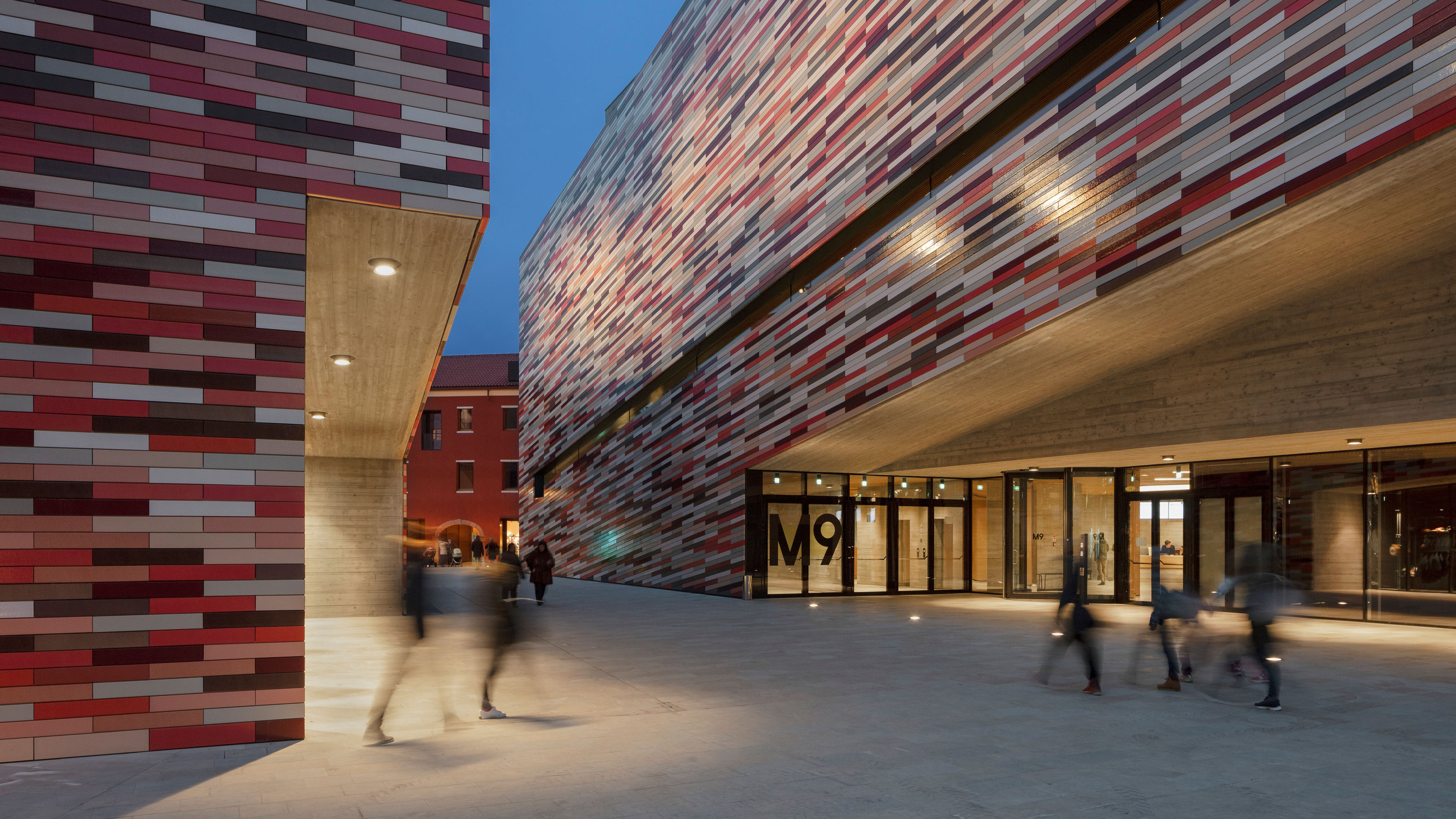
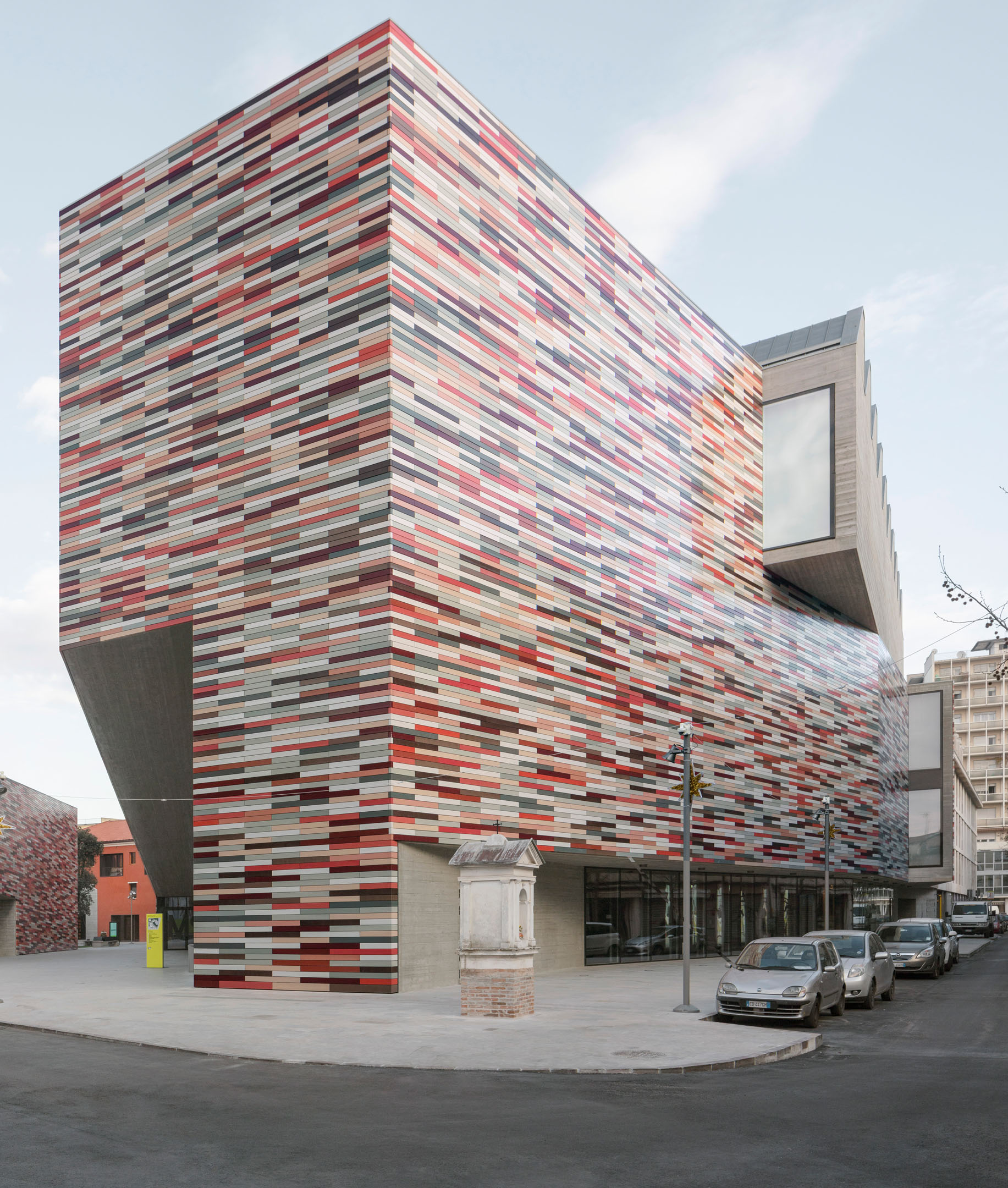
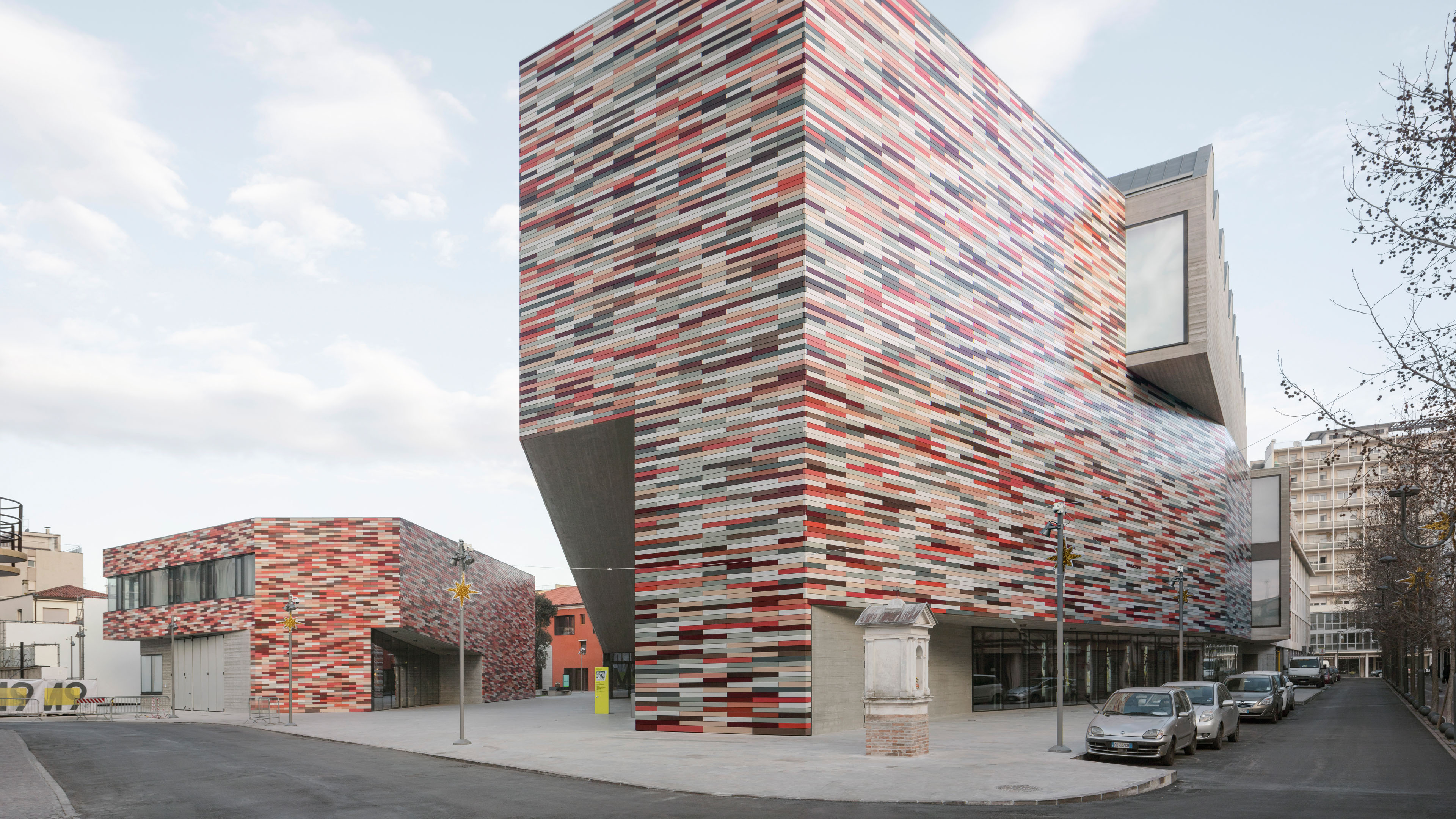
Part of this development was the ‘M9 New Museum for a New City’ competition in 2010, which Berlin architectural firm Sauerbruch Hutton won. Sauerbruch Hutton is mostly known in Berlin for its design of the former GSW building in Rudi-Dutschke-Strasse, a 17-storey high-rise with a striking, radiant facade in varying shades of red, created by different-coloured shutters. The outer wall of the new museum is clad in horizontal ceramic strips in different colours, which are based on the earthy tones of Venetian building tradition: oxide red, ochre and oxide green.
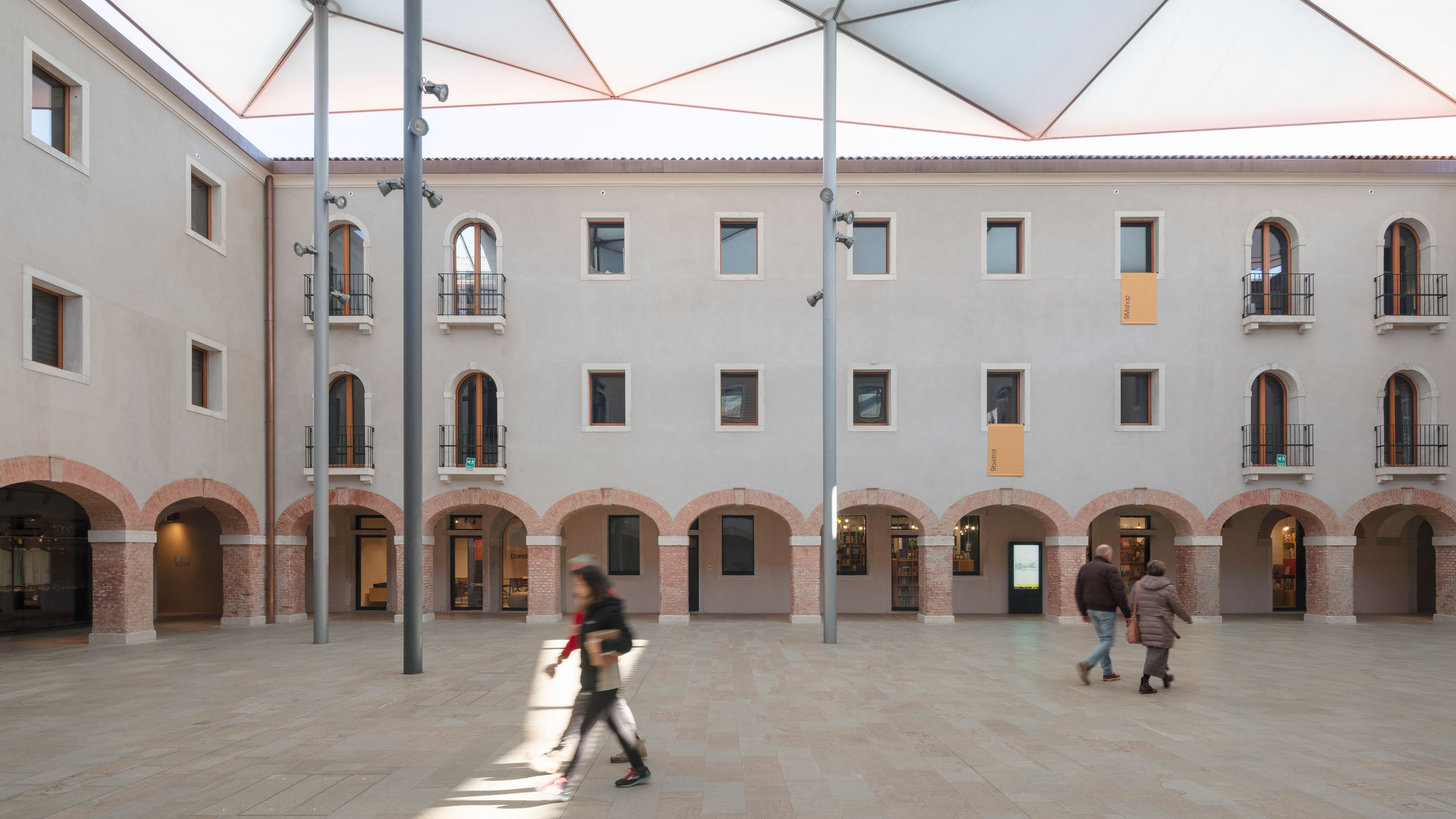
Everything had the overarching goal of giving Mestre a vibrant centre with an offering for its residents first and foremost. For example, a co-working space will soon open in one of the buildings, drawing in young people to the quarter. The large inner courtyard of the former convent will invigorate the quarter through the events it hosts throughout the year and for this purpose was fitted with a lightweight membrane canopy suspended over the roof of the old building. The project included a late-16th-century four-wing building enclosing the courtyard, which the architects renovated and redesigned for new use, primarily by businesses and restaurants.
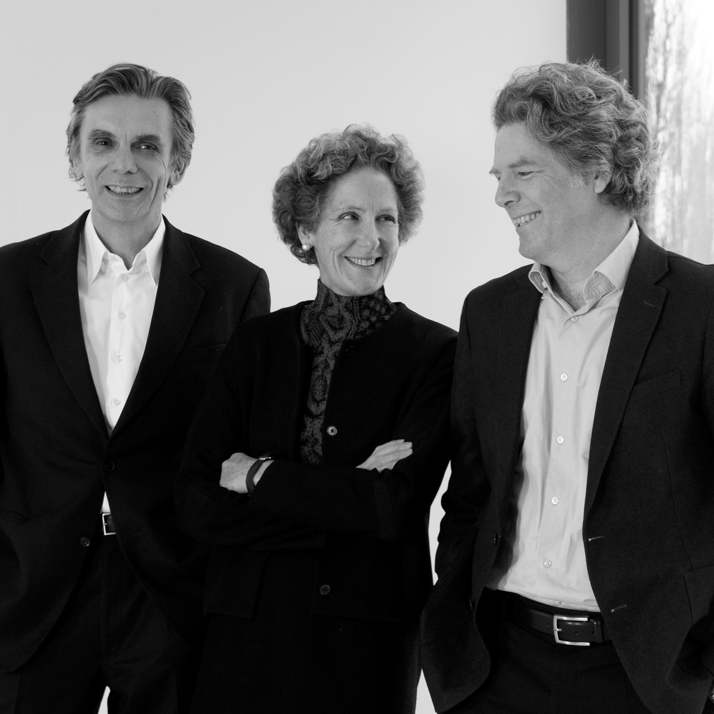
Architect and object
Foto: © Claire Laude
‘The central image for our M9 design is the traditional Italian city with its plazas, streets and alleys – and the Italian tradition of outdoor living,’ the architects explain.
Public life at the centre of the via, piazzetta and piazza
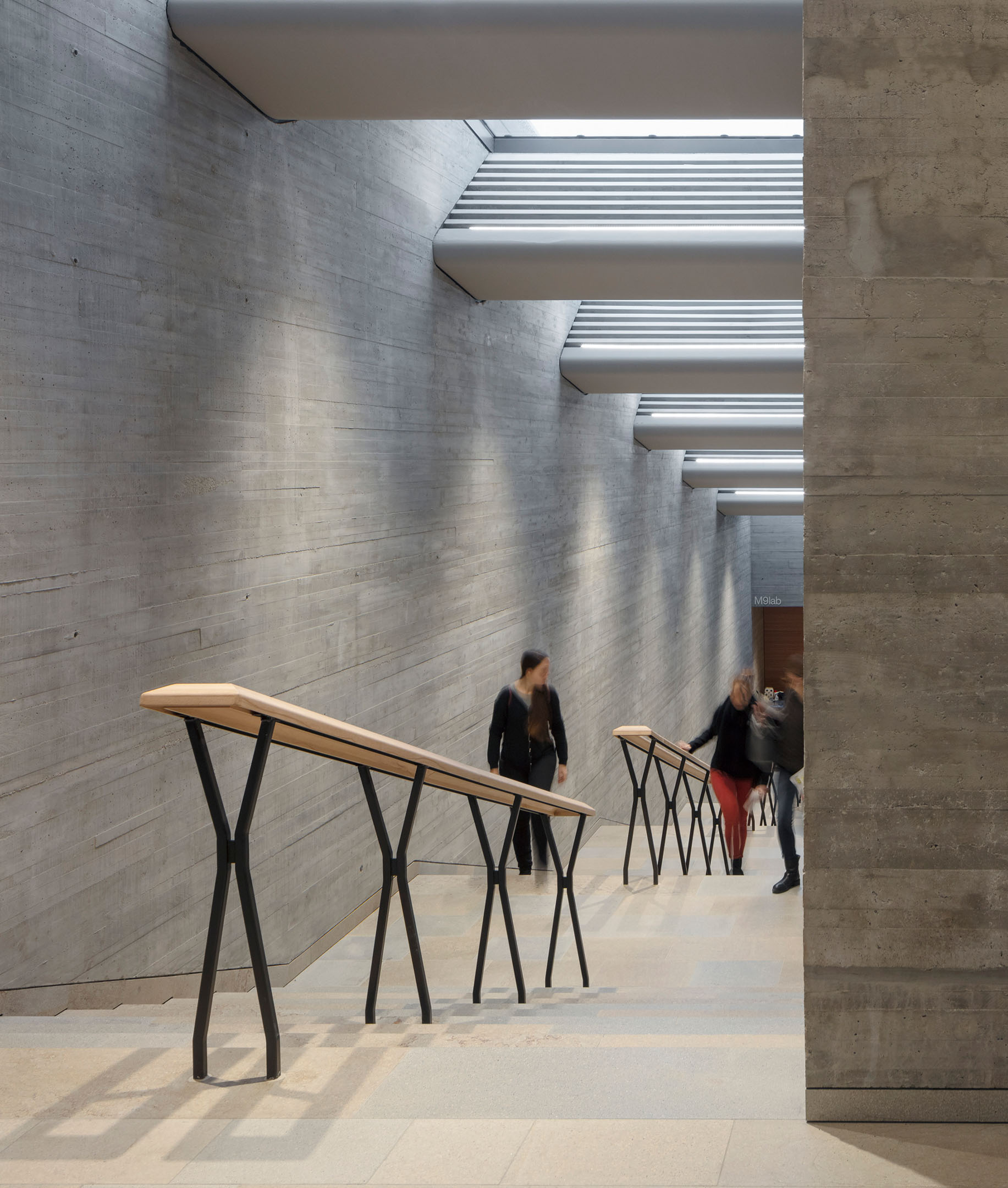
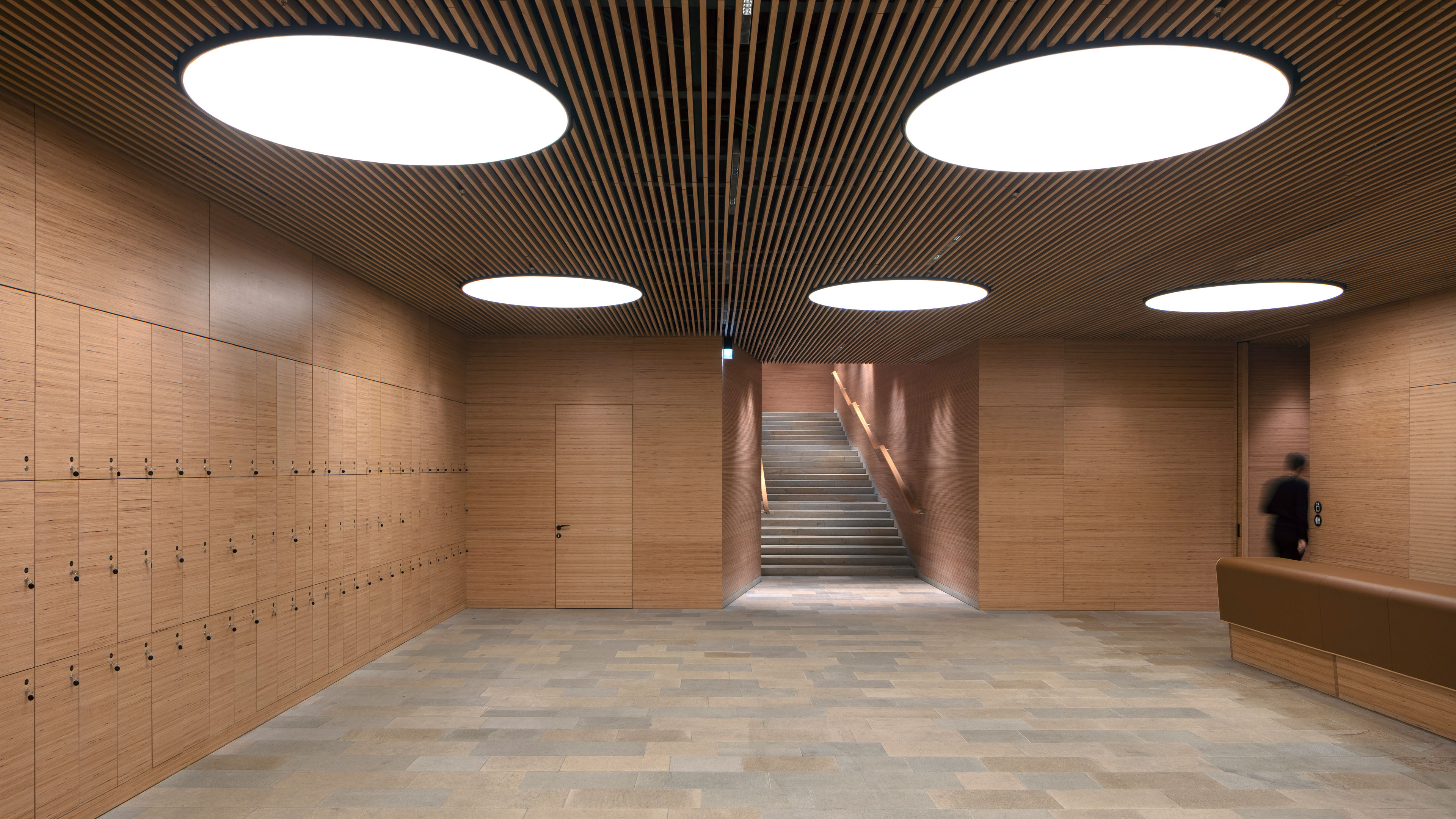
The actual centre point of the design is the newly created pathway that acts as a central axis running between the ensemble of new buildings, which consists of two parts, and through the now covered inner courtyard of the old convent. It opens up a new axis between the Piazza Erminio Ferretto and the vibrant shopping street Via Cappuccina, while also providing access to inside the block (previously closed to residents), where a newly created piazzetta, or small plaza, invites visitors to stay awhile. Restaurants and businesses in the old arcades bring the inner courtyard to life. By splitting the space into a main building and a smaller service and administration building, the M9 blends in well with the existing sectioned fabric of Mestre.
The project encourages movement towards more public life at other points in the urban landscape as well. The energy-efficient facade with a new shop window on an existing office building opens to Via Poerio and breathes fresh life into the space. The M9 museum building itself is also designed for public life. The pointy ‘ship’s bow’ of the building on the ground floor will house a large amphitheatre for events that stretch into the night. The hall was also designed for use as a cinema to offer additional viewing space for the Venice Film Festival. It allows Mestre to profit from the success of its counterpart across the lagoon at a cultural level as well. It remains to be seen whether future developments in the quarter on the mainland will be executed as thoughtfully and with such consideration for residents of the city as this project by Sauerbruch Hutton was – and whether Mestre will flourish as Venice has.
The selection of handle in this case was obvious: the architects opted for their own design. The FSB 1230 and 1231 model series were specially designed by Sauerbruch and Hutton and fit in perfectly with the overall design of the M9. A sophisticated shape with several curves and a grip section that pushes back against the hand in a way sits on a short neck that ensures that the model fits all kinds of doors and applications. A cranked version is not needed for narrow-stile doors. The handle is installed with a black anodised micro-blasted finish that blends in perfectly with the black-grey facade profiles and elements of the finishings. The rougher surface gives it an especially pleasant feel. In addition to window and door handles, FSB panic crossbar fittings were also used. Read a recent interview with Sauerbruch Hutton in the FSB blog.
Object details
Photos: Jan Bitter Fotografie
